Color Selection During Display Stand Design
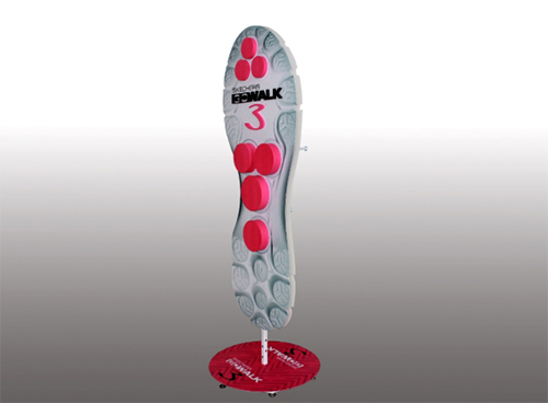
Description of the main colors of the display stand design. This article mainly wants to clarify that the main color is the logo color of the enterprise or product, that is, the matching of the logo color. In this way, we can show a unified view of the main display rack design concepts and corporate ideas, better publicize them, and deepen their impression of the company or product.
So for the designer of the display rack, they should try every way to make the audience feel good. Color is one of them, but it is very important. It is important to determine success or failure. There are still a lot of hungry requirements for designers. This depends on the consistency of the concept of coordination between the designer and the company, and how the designer can master the technical level of color. Cosmetic display racks, clothing display racks, jewelry display racks, etc. must have the attention of these colors.

Reference color design note:
1. While considering the time (season), exhibition location, lighting arrangement and other factors of color design, it is necessary to consider the enterprise and the exhibits. Colors should be selected and used according to the exhibits. Because visitors often associate exhibits with specific colors, the two match, and the use of associated colors to decorate the exhibition stand to show exhibits will give people a "logical" feeling and help memory. On the contrary, if there is a serious disconnect between the color and the exhibits, the two are not matched, and it is unrealistic for the audience to remember them bluntly.
2. The color design of the display rack also has a concise principle (cosmetic display racks and clothing display racks can be reflected). Too much color change is likely to cause visual fatigue but not achieve outstanding results. Using the standard colors and their approximate colors in the corporate logo can solve the above problems very conveniently. The color design of the logo is extremely precise and concise. In terms of accuracy, the choice of color for the logo is the most demanding and rigorous of all artistic forms. It must conform to the nature of the company's products. What kind of products have what characteristics, it must be reflected in what color. it.
3. The color design of the booths of many large international companies always uses logo colors as the basic appearance, such as Coca-Cola, Minolta, Kodak and so on. This color design always impresses the audience. Taking the LOGO color as the color part of the booth design, using the standard color of the logo (LOGO color) and its approximate color makes it easier for the entire booth to form a harmonious and unified visual environment.
Simple and harmonious beauty is the trend towards aesthetics of modern people. All efforts are for the ultimate benefit of the enterprise, so it is important to fully understand the color concept of the customer base.


